To read this post in German, please continue here.
Redesign for better usability
Usability has always been of the highest priority to our designers and user experience experts. However, the original design of Signavio has dated over time, and is no longer up to our own high visual standards. Therefore, we recently employed a more contemporary and concise flat design approach when developing new Signavio applications. We’ve been continuously enhancing the design on new applications to get just the right look, but until now did not take the step of rolling the changes out across the whole application set.
Now, our designers and user experience experts are working on a step-by-step overhaul with the goal to consistently use a modern and appealing design across all our applications. These changes will not only make Signavio look better, they’ll also incorporate the following user-centric improvements:
- We will reduce color contrasts to allow users to focus on the core control elements.
- We will employ consistent symbols and usability concepts throughout all applications and additional media resources, like our website.
- We will keep the general layout clearer and tidier.
- We will improve support for high resolution screens.
With these changes, using Signavio will be even more straight-forward and enjoyable! Our goal is that the redesign enhances your modeling experience, making Signavio a true facilitator of your process management initiative.
The Diagram Comparison and the BPMN Simulation have already been overhauled. All other components that still employ the old design will follow:
- QuickModel
- The Dictionary
- The Commenting View
- The Editor
- The Explorer
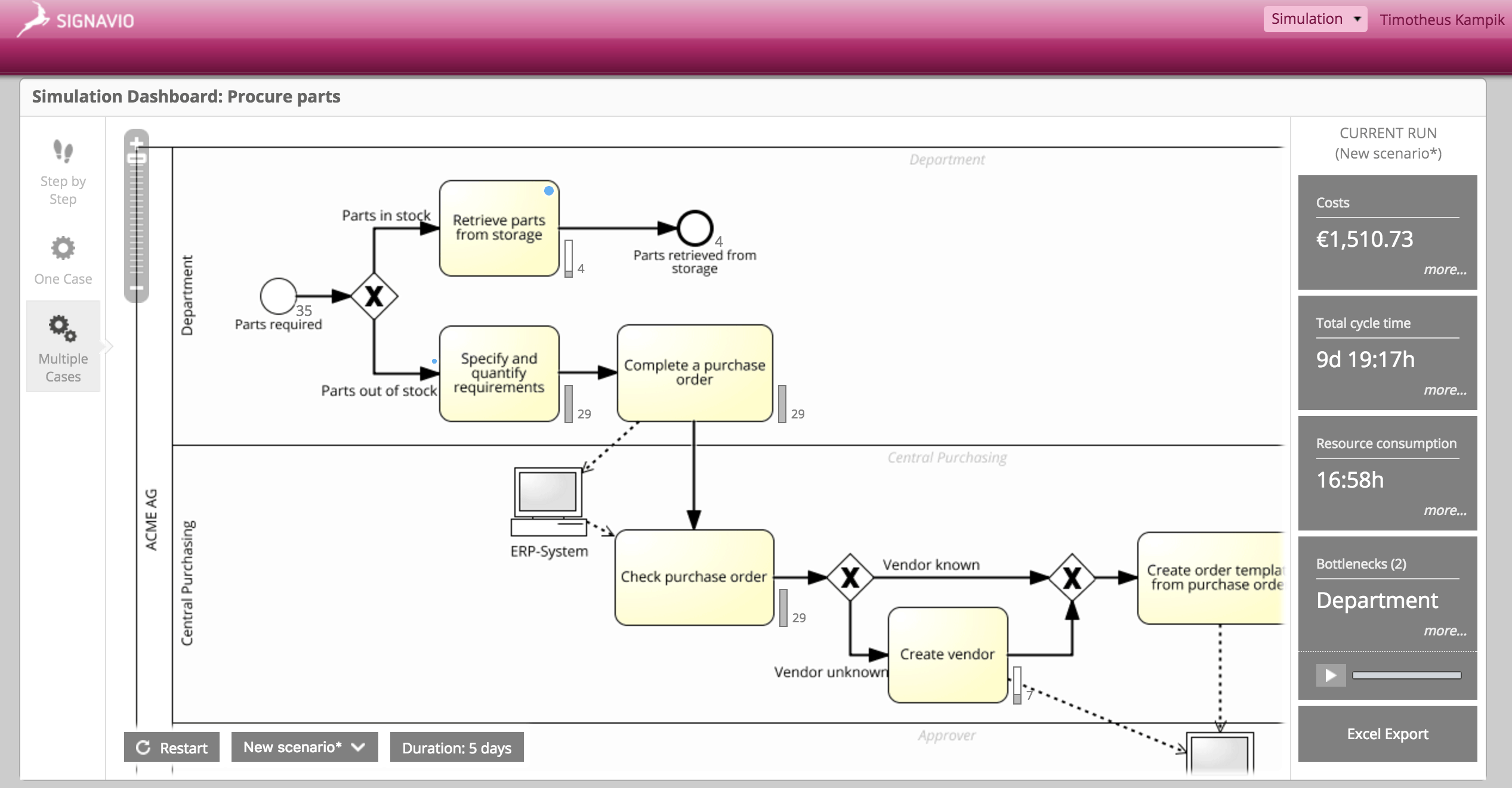
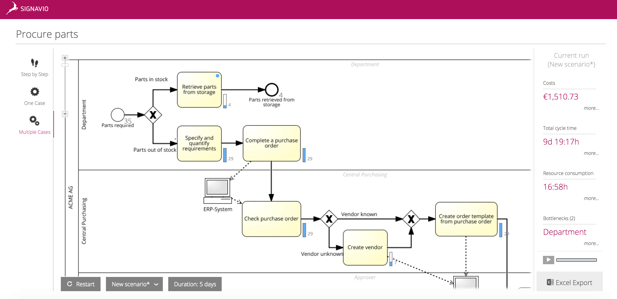
The following screenshots offer a “before and after” comparison of the BPMN Simulation tool:
As you can see in the screenshots, our improvement efforts focus on the look and feel of the application, while we retain the well-established intuitive functionality of the application.
As soon as all apps are updated with the new design, we will explain the changes in detail in a webcast. Detailed information will follow on our webcast page.


